RANT TOPIC: Music Event Tour Posters & Flyers
Mar 08, 2023
Mind if I rant???
As many festivals, large and small, around the country (and the world) are dropping their line-ups, I can't help but shake my head as I scroll through my Instagram feed, wondering what century some of the graphic designers (and festival producers who sign off on their work) are living in.
So, for the first time on the DSP blog, as a big music fan, and active member of the music industry, please allow me to officially rant...
Dear gig poster / flyer designers (gigs / tours / fests) and artists / producers who hire them...
It's 2023. The vast majority of people seeing posters and flyers are looking at them on a smart phone --- not a computer monitor, and not in print (especially when the event is first announced to the public).
With that in mind, if you want to make it easier on music fans, also known as "ticket buyers", to get your message:
1. Make sure that ALL of the information on the poster is legible from a smart phone, preferably from Instagram where it's WYSIWYG when it comes to viewing and zooming (yes, there is a somewhat roundabout way to zoom on IG, but by then you've already lost your viewer).
Though your fancy fonts and font shadows/glows may look great on a larger print version, if it results in the text being unreadable on a phone, then it's nearly useless.
Case in point, the line-up was dropped today for a major festival in the Southeast USA. When I saw the post on my IG feed on my phone (an iPhone 11, in case you were wondering), all I could read were the names of the headliners. Not good.
Even worse, when I went to view the same graphic in the Facebook feed on my 27" Mac display, I could barely make out the lower-line artists. Not only is this frustrating for me, a music fan, but it is also disrespectful to those artists who are not only buried at the bottom of the line-up, but you can't even read who they are anyway.
On top of all of this, the date and location for the event are nearly impossible to read due to the small font size and the lack of contrast between the font color and the background color. (see points 2 & 3 below)
Sure, it's a cool looking poster from a distance and probably makes for great wall art, but it's an abject failure when it comes to displaying essential information to those who may be interested in attending.
2. Make it easy AF to find the dates of the event(s).
3. Make it equally easy AF to find the location (e.g., the city and state of the festival). And, no, not everyone thinks your fest is the most popular event on the planet, and knows where it is located, so you can wrongly presume that you can leave that vital info off of the artwork. Your audience is GLOBAL.
NOTE: For points 1, 2 & 3, remember that we live in a world of instant gratification where people have extremely short attention spans. If viewers of your art have to work hard to find important information, you'll lose them, and lose them very quickly.
 SOLUTION: Either make the artwork clearly readable in both print and electronic form (on handheld devices), or create two separate pieces of art -- one "high end" piece for print and merch sales, and one that is specifically laid out for smart phone / electronic displays. Yes, that will cost more to double up on a design, but it won't take many ticket sales to get the ROI.
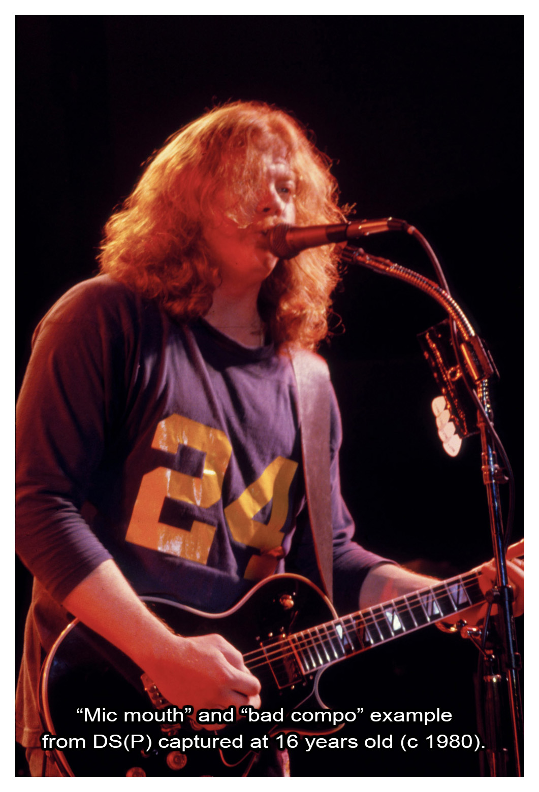
4. And, finally... If you are including an actual photo or photos on your poster or flyer, invest in quality photography. When you show a "mic mouth" shot, or other amateur type of composition, or something that was obviously shot with an archaic iPhone 6, it's a reflection of the quality of the performing artist's attention to detail and, by extension, their passion for their own art. If you acquired the images for free from a "fan with a camera", then there is a reason why they were free.
SOLUTION: Hire an experienced professional music photographer to create top-quality imagery for your marketing materials, or see what those same photographers have in their archives as "stock" photos. Spending a few bucks to significantly upgrade your gig flyers is a worthwhile investment. And, you'll be supporting a fellow artist by doing so. I would be more than happy to help. CLICK HERE
Rant over.. for now.


